The Ouse Valley Eagles football team is a group of talented players within the British American Football Association.
There were two teams in the Bedfordshire area who struggled with the number of players. The committee of the two teams discovered a huge opportunity. Instead of finishing both of the football programs, they worked together to save this brilliant sport. They merged the two associations and the Ouse Valley Eagles was borne in 2013. The heritage of the teams was very important: Respect the past, represent the future. After a successful first year, they were on the right path and carried on with a new brand identity design.
I went on redesign the logo, create a collection of social media graphics, a series of posters for their scheduled season games and some promotional materials.
Since the project has launched, the Eagles has been a tremendous success, achieving a much wider player bias in the area and the team now has a strong foundation. They have started a youth program too. Their identity is differentiated from other teams in the United Kingdom.
Ouse Valley Eagles
Brand Identity Design
Logo Design
Marketing Collateral
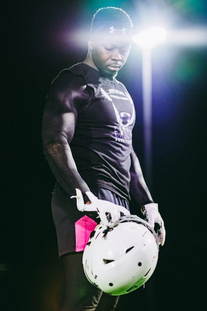
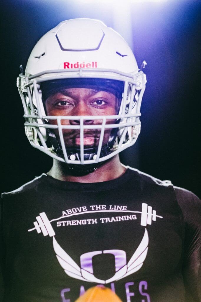
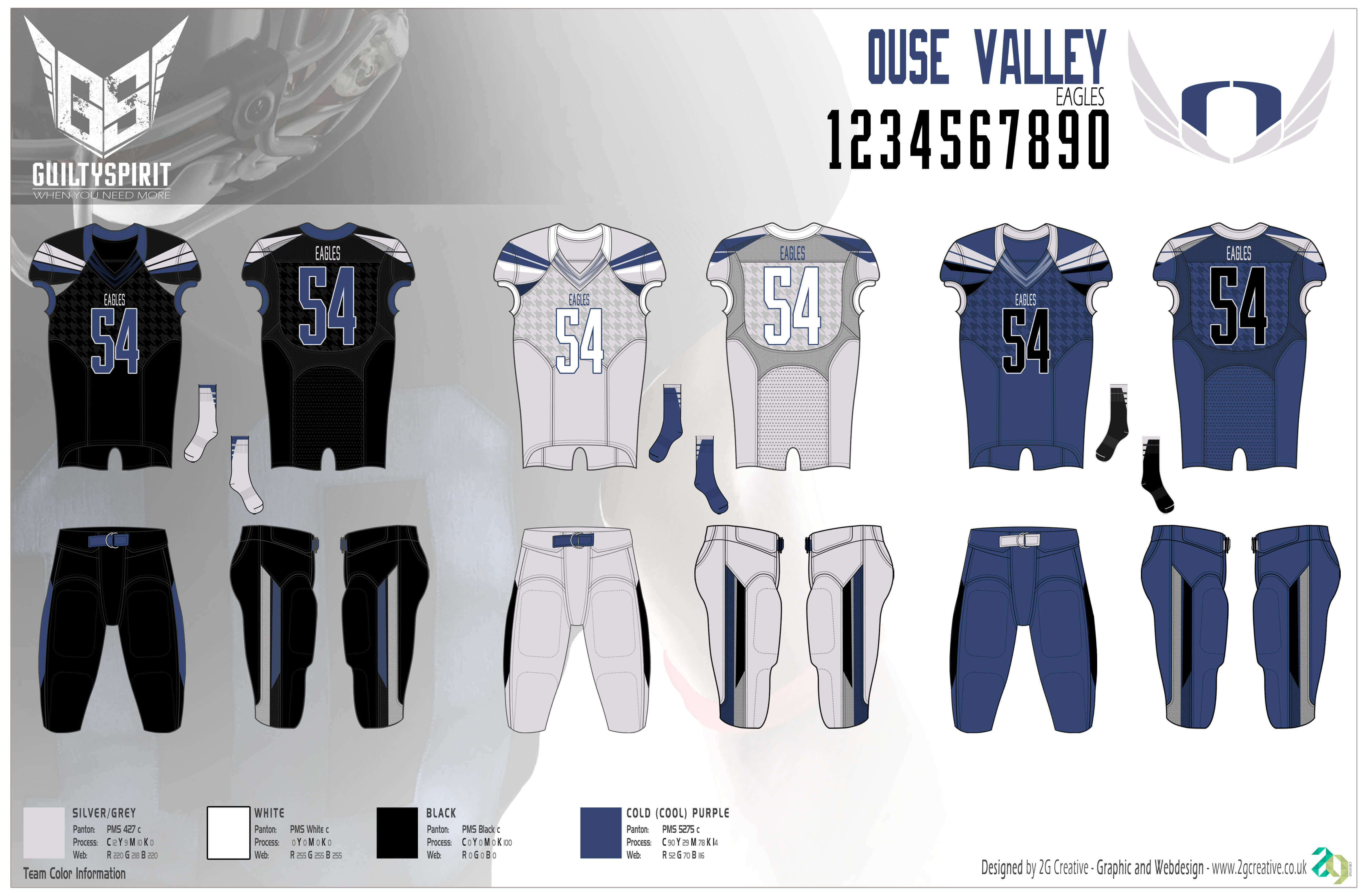
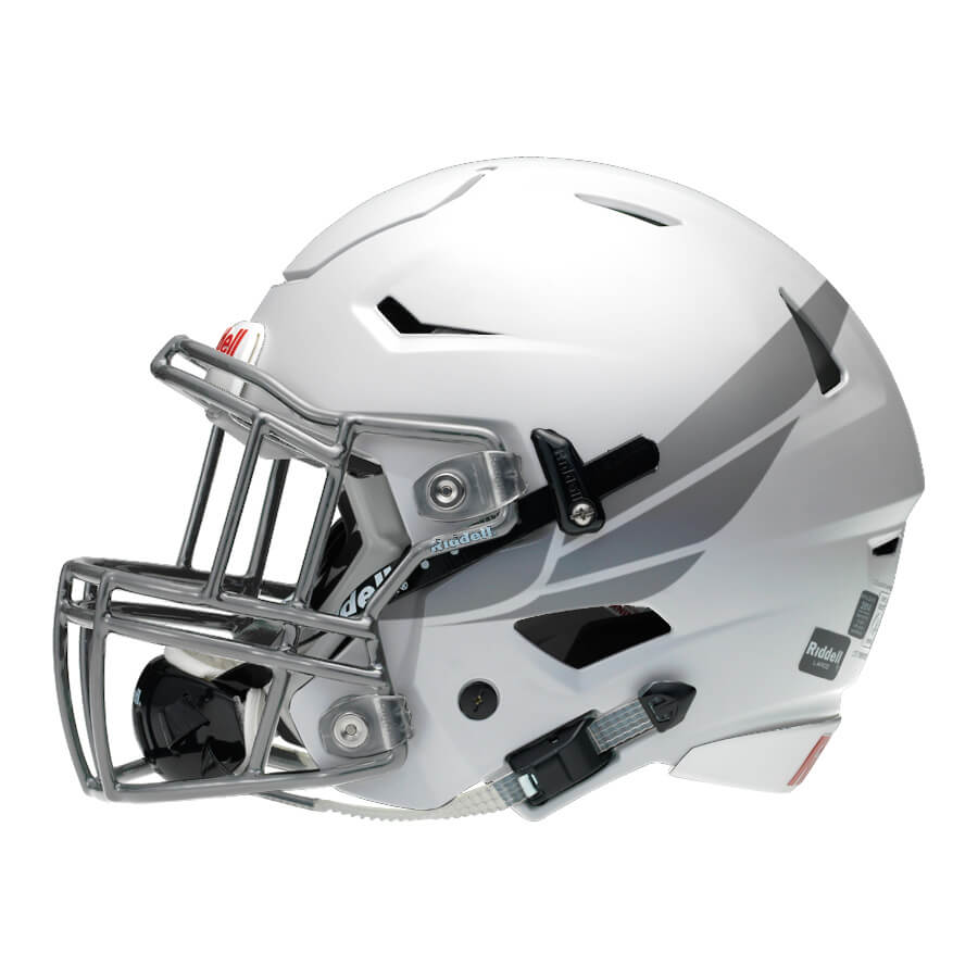
Uniform Design
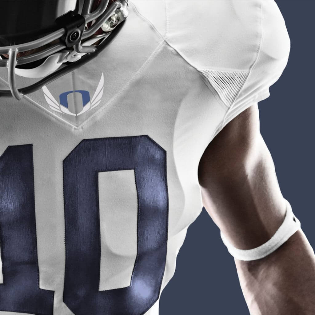
The first challenge was addressing the limitations of their original logo. The team wanted to keep the structure of the design with the wings and the ‘O’ letter mark. The room for new ideas was very restricted. Also, it was important that the design works in one colour version for merchandise. As soon as the team used the original logo in one colour, the details lost and didn’t work well.
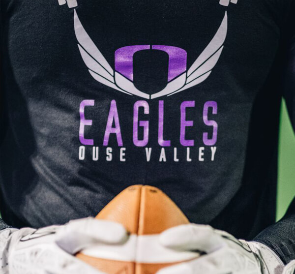
The most important challenge was to reflect the heritage of both teams. The logo design honours the past while evolving into the future. The ‘O’ letter mark remains, but updated to reflect the team rich history. A new fused was crafted with the ‘O’ and ‘V’ forged together into one icon represents the coming together of Milton Keynes Pathfinders and Bedford Blue Raiders to form the current club. Also, the fused letter mark better identifies with the Ouse Valley region with representing the strength and toughness of the region. The wings remain, in a more contemporary, simplified version. It is representing the clubs future aspirations and incorporating the club’s motto, “Alis Volat Propriis – One Flies with One’s Own Wings” into their logo. Spread your wings…
Color & Material
The new purple represents the clubs heritage, combining the Blue of Bedford with the Red of Milton Keynes to form a bold and rich colour that will form the backbone of the club for the future. The silver and white primary colours remain unchanged.