The Pecs Legioners team is a development american football team in Hungary. Their core player bias comes from the local university. The management of the team has contacted me about a logo for the newly formed team.
Because of the name, my process of the design was quicker than usually, as I already know which direction I wanted to go. As a nature of the sport logos, the legionnaires mascot was the most suitable option for this project.
Since the project has launched, the Eagles has been a tremendous success, achieving a much wider player bias in the area and the team now has a strong foundation. They have started a youth program too. Their identity is differentiated from other teams in the United Kingdom.
Pecs Legioners
Identity Design
Uniform Design
Typography
Illustration


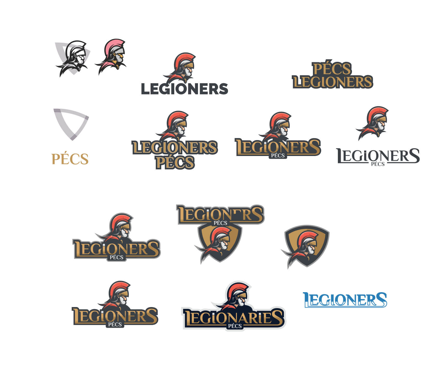
The management of the team has started something new. The team is called Legioners the reason behind it is the Roman heritage of the city where it is established. Pecs (Hungary) was called Sopianae, and it was the capital of Pannonia Valeria in the northeast province.
I have created a mascot logo what is reflecting the name and the strength of the team. The mark is showing a Roman soldier who has been in some battle this what you can see on the galea helmet. Also, my focus was to use a recognizable type for this logo design, which gives back the feeling of a Roman empire. Hence the reason I used a Sans Serif font what works well with main mascot design and balance it. The lettering and the mascot of the logo can be used separately.
I was working on the hierarchy and the position of the elements. I have centralized the logo. Also, I was thinking to place the design in order to a shield or badge type of design. You can see this try below. However, I have thought this concept would not work well.
This wasn’t my regular logo design process as I already knew the route. During the design method, I have explored some options. However, I have settled at the below design


Color & Material
Selecting the colour of the logo was an easy task. The team wanted to use the colour of the Roman soldier’s uniform what is red, silver, gold. The gold is coming in when I was designed the team uniform and some merchandise like hoodie. For giving depth for the logo, I have used a dark navy colour for the outline. This solution has brought out the other colours, and it helps to give the feeling of a strong team.